Design for user’s mental model
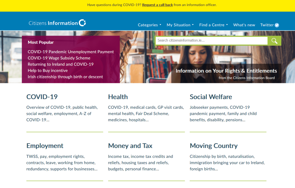
Looking at the Citizens Information webpage you can see that it was designed with simple usability in mind.
The very clear grid-structure on the front-page allows you to find your topic without needing to search for your desired target-location via frantically hovering over the mega-menu.
The grid structure provides a calming layout that let’s the eye travel to find what it’s looking at own pace.
The colors used are slightly muted and also have a calming feel to them.
Plenty of white space and clean sans-serif dark font provide a clearly legible contrast rich reading environment.
I believe all the above leads to a user experience that soothes the mental model of being on a website to research serious information.
The common perception of any source providing information on public and social services could be described as of claustrophobic distress from barely understandable bureaucratic content on forms to be filled in.
This page was clearly designed to counteract such expectations employing a variety of calm-evoking tools. Having such kept the mental model of the visitor in mind they have created a surprisingly pleasant experience.